Did you know that colour psychology also applies to your home? The colours in our homes are constantly influencing how we feel each day. Read on to discover how different room colours can affect your mood.
Did you know that the colour spectrum is used in radiation therapy? This is known as chromotherapy and is based on centuries of research into the visible spectrum and its impact on us. Colours have been linked to emotional and mental effects in numerous studies, and the impact of room colours on mood has become a fundamental principle in psychological interior design. While we all have our colour preferences, it’s essential to understand how different shades affect our emotions. For instance, do you really want your favourite colour, “red”, to boost your energy in the bathroom? Maybe—but for others, calming tones might be a better choice. The beauty of your home goes beyond themes and style; it’s about how you feel within it. Your colour choices also play a crucial role in the aesthetic appeal of a space, helping to create a visually harmonious and inviting environment. Mastering the power of colour takes patience and planning, but it can transform your living experience. Colour theory provides a foundation for understanding how different colours affect mood and atmosphere, guiding you to make choices that enhance both emotional well-being and visual harmony. Follow this guide to explore how room colours shape our emotions and environment.
Introduction to Colour Psychology
Colour psychology explores how different colours affect our emotions, mood, and even behaviour. In the world of interior design, understanding how colours impact mood is essential for creating a living space that feels just right. Each colour can evoke different emotions—some shades can make us feel calm and relaxed, while others might energise or inspire us. By incorporating colour psychology into your home, you can intentionally design rooms that support your desired mood, whether that’s a soothing retreat, a lively gathering spot, or a productive workspace. The psychological effects of colour go beyond personal preference; they tap into universal responses that influence our well-being and daily experiences. By learning how colours affect mood, you can make more informed choices that transform your living space into a true reflection of your needs and personality.
The Effect of Room Colours on Mood: An Introduction to Colour Psychology
The brain is making unconscious subconscious decisions every millisecond. Through recognition of behaviour patterns, scientists have been able to assign psychological values to colours. These values are tied to emotional responses, decision-making, and judgments. It is said that, subconsciously, people decide on products within 90 seconds of seeing them. Colour has a huge impact on these quick decisions. Certain colours can influence mood and evoke feelings, as the psychological effects of colour choices can create specific atmospheres and emotional responses within a space. If you intend to sell your home, think about how colour can influence buyers. Consider how to choose colours for your next renovation and explore using furniture, rugs, tiles, and chairs as inexpensive solutions. Ideally, you want to have three to four main colours in a room at most. Get to know your primary and secondary colours; this will enhance your ability to control the mood of a room.
Colour Palette and Mood
The colour palette you choose for a room plays a powerful role in shaping its mood and atmosphere. Different colours can evoke a wide range of emotions, so selecting the perfect colour palette is about more than just matching your décor—it’s about creating the right feeling for each space. Cool colours, such as soft blues and gentle greens, are known for their calming effect, making them ideal for bedrooms or living areas where you want to promote relaxation and a soothing environment. On the other hand, warm colours such as vibrant reds, oranges, and yellows can boost energy levels and stimulate conversation, making them perfect for dining rooms or social spaces. Neutral tones, such as beige, grey, and off-white, provide balance and stability, helping to ground bolder accent colours and create a harmonious look. When choosing a colour palette, consider factors such as natural light, room size, and the desired atmosphere. Lighter shades can make small spaces feel more open, while darker colours add coziness and depth. By thoughtfully selecting your colour scheme, you can ensure your room not only looks beautiful but also feels just right for its purpose.
Every Category of Colours Explained for Building Your Colour Palette
We’ll divide the different room colours into three categories: neutral, active, and passive. As long as you remember these three categories, you can mix until your heart’s content. You’ll find that primary and secondary colours work together to offer balance in these colour themes. Additionally, certain colours within each category can have distinct effects on mood and atmosphere, influencing how a space feels and the emotions it evokes. Another thing to remember is that the darker shade of a colour, the more subtle the impact. Think of a purple bean bag! Brighter shades will make rooms feel bigger and more energetic. We’ll touch on these elements as we go over each colour.
Reds
The colour red is pure energy, adrenaline, and passion—a bold choice in interior design that makes a confident and striking statement. You’ll find a lot of use for red in the living room, hallway, and most kitchens. Red is also often used in dining spaces to stimulate the appetite and create an inviting atmosphere. Use of red has to be strategic; it can easily overwhelm a room’s energy. For example, red can go great in a bedroom, but stick to accents and darker shades. Choosing calming colours for bedrooms can promote better sleep. This touch of red can make you feel passionate and alive, but only at the right times. Too much red can make you feel restless, frustrated, and stressed. The colour red will raise the body’s temperature, blood pressure, and sense of awareness. Red is a powerful colour that can dramatically transform the mood of a room, making it effective as a warning sign or for directions.
Yellows
Bright yellow hues will open up any space and bring an energising, vibrant feel. Yellow is associated with happiness, playfulness, and health. Yellow has a way of lifting the mood almost instantly and assists the body in producing serotonin. Yellow is also used as a color to attract attention. You can use yellow accents to break up patterns and keep a room from feeling stagnant. Yellow is best suited for bathrooms and kitchens. It will require more effort to maintain cleanliness, but that means improved sanitation. It is also worth considering that yellow may seem unnerving as the dominant room colour. Babies cry more, and people can get nervous in all-yellow rooms. Soft yellows, on the other hand, can add warmth and brightness to a space, especially when paired with cooler tones like blue, creating a harmonious and inviting atmosphere.
Blues
The universal colour palette associated with calm and serenity, blue hues are especially known for their calming and relaxing qualities. Facebook and other major tech companies chose blue to appear more personable to people. It’s a colour associated with feelings of safety and security. Blue has been proven to lower heart rate, decrease stress hormones, and promote relaxation. Incorporating blue hues into your decor can help create a calming environment that promotes relaxation and supports mental health by reducing anxiety and enhancing overall well-being. Blue is the opposite of red in ways that affect rooms. It fits well with children’s rooms, dining rooms, and bathrooms. Bright blue shades can evoke a unique sense of joy and safety simultaneously—all shades of blue work well in naturally lit spaces, such as the kitchen or living room. Mixing blues with neutral colours will enhance their calming effect. Mixing blues with darker colours will bring the mood of the room too low, so take care. Blues also work great for ceiling colours and accent furniture. This can help balance a room filled with more energetic colours. Blue is often used as a softener for rooms with industrial or modern themes.
Greens
The colour of money, the sign to go, and a safe colour to put into any room. Green covers a wide spectrum of uses, especially when mixed with secondary colours. Green is closely associated with nature and represents stability, as well as prosperity. Green is highly effective in representing nature, and its presence can have a calming influence on the nervous system by lowering stress and promoting a tranquil environment. Green tiles help reduce stress by bringing nature indoors. Green is a great colour to pair with blue, creating a calming effect. You can also use bright greens to pair with yellow or red, creating a flow of energy. Green is used for directions and pathways, making it ideal for entrances, exits, and hallways. Because green isn’t a dominating colour, there’s no such thing as too much of it. Alternate between bright and dark greens to avoid making a room feel boring.
Purples
People often associate purple colours with femininity, luxury, and mystery. Purples take on a new life when paired with complementary colours, such as blue or red. It’s a great choice for the master bedroom, as it encourages passion and desire. Purple can also make a great accent colour to bring a unique character to a room. It creates intrigue and feels welcoming to outsiders. If you go into the lighter pink side of the spectrum, you can tap into feelings of creativity and laughter. Lighter purples can also enhance tranquillity and elegance in a space, making them ideal for creating a calming and sophisticated atmosphere. Try to think about using purple outside the concept of genders, and you’ll set your home’s interior apart from the rest.
Oranges
On a similar note, orange is like a happy medium between red and yellow, and as one of the warmer colours, it promotes energy and vibrancy in a space. The colour orange is often used as a caution, but not in the emergency “red” category. You should attempt to apply orange colours to your bedrooms and living rooms. This makes for a great way to keep the house energy levels up and encourage activity. You can designate certain areas for rest by using orange as a divider. Orange is a colour that naturally generates warmth in those nearby. Employ some orange colours for those cold winter nights.
Whites and Beiges
Now that we have covered all the big colour categories, we are left with our support and neutrals. On the lighter end of the spectrum, we have white and light brown. White is often used in places where no creative input is given. White walls and ceilings are the default in many homes, but it's what makes many homes unremarkable. Beige does the same thing when it's found in so many fabrics. We recommend reserving white for places that feel dark or small. Beiges are great for creating a beach house-inspired look or southern comfort.
Blacks and Grays
Black is often neglected as a defining accent piece. Black should be used in every room to some degree. Usually, this means adding sculptures or furniture pieces that are black in colour. Don't underestimate the impact that a black accent wall can make on a room. Think of how some cafes or restaurants use black as their backdrop. Black reduces busy parts of rooms and restores balance. Greys are the best buffer between virtually every colour, especially black.
Fluorescents
The last category we want to cover is made up of the brightest colours. Neon lights and vibrant hues require smart placement. Unlike your average bright colours, fluorescents often leave a lasting impression to the point where you always seek them out. They can become a distraction or cause irritability. They can also create joy and enhance play areas. Kids will love them, and families can use them to designate their own spaces.
Colours on Walls, Ceilings, and Furniture
When planning your colour scheme for any room, consider the surface area. You can divide each room into three separate categories: walls, ceilings, and furniture. We’re leaving out floors because we assume each room won’t have its own flooring. Ceilings are usually the same for every room, too, but we encourage making use of colour in this space. Testing paint samples in different lighting ensures accurate colour perception for your space. It’s much easier to paint a ceiling than to lay separate flooring for each room. So, pay attention to how colours impact the room from the ceiling. Conduct an online search for creative uses of ceiling spaces. Feature walls are another effective way to add visual interest and define spaces within a room, serving as accent points that enhance the overall aesthetic. The basic colour rules that we covered above still apply here, too. Bright colours to make the roof feel bigger, darker colours constrict it.
Incorporating Colour Psychology into Design Decisions
Bringing colour psychology into your design decisions can transform your home into a space that truly supports your well-being and personal style. Interior designers often use colour psychology as a guide when selecting paint colours, soft furnishings, and décor, ensuring that each room evokes the desired mood. For example, choosing cooler shades for a home office can help you feel calm and focused, while warmer shades in a living room can create an inviting atmosphere for guests. It’s essential to consider how natural light interacts with your chosen colours, as lighting can significantly alter the way a colour appears and feels in a room. Don’t be afraid to experiment with accent colours through cushions, rugs, or artwork to add personality and depth. By incorporating colour psychology into every aspect of your design—from wall colours to furniture and accessories—you can create a living space that not only looks stunning but also feels perfectly attuned to your lifestyle and emotional needs. The right colours can make all the difference in promoting relaxation, boosting energy, or simply making you feel at home.
Decorate for Comfort and Style
We hope that you have a better idea about how to harness the power of colours for psychological benefits. Different room colours are preferable to a single, strict colour theme throughout the home. It works great on the exterior, but inside, it’s a better use of space to use colours differently. If you’re on a budget and want to change your room’s colours, you can start with the furniture. In home offices, choosing the right colours can enhance creativity, productivity, and overall well-being, making your workspace more inspiring and focused.
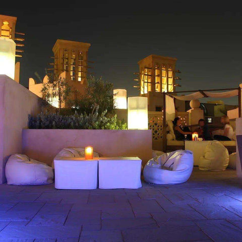
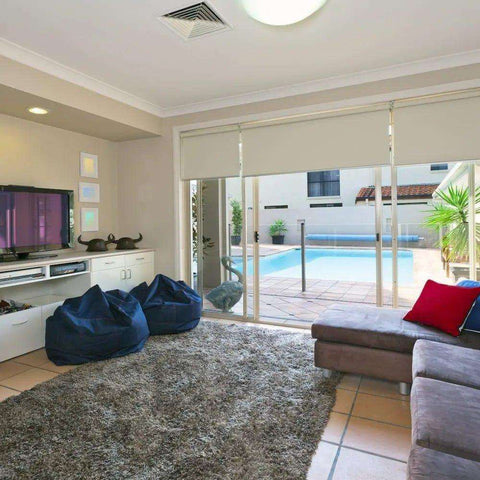
Until you’re ready to embark on a big painting renovation, you can benefit from throwing some colour centrepieces into your home. In living and dining rooms, vibrant and energetic colours can help create lively, dynamic, and inviting spaces for socialising and activity. Check out our colourful selection of ottomans and beanbag chairs for inspiration. These comfortable splashes of colour can make a difference in how you feel in your home. Thoughtful colour choices can help transform your space into a peaceful retreat, evoking positive emotions and promoting comfort, tranquillity, and a harmonious atmosphere.